Analysing and deconstructing a Magazine
Front cover
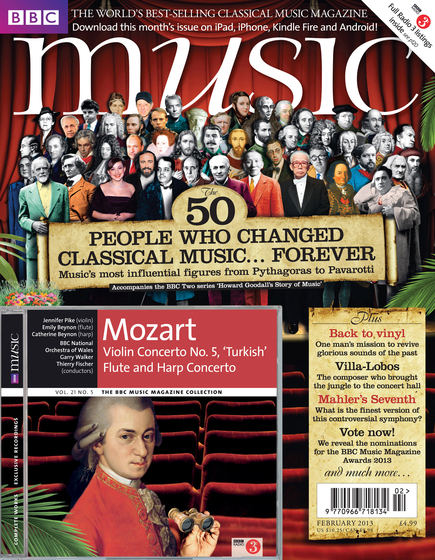
This is the front cover to our magazine that we made an analysis on called 'Music'.
We looked at the magazine 'Music', a classical music magazine and analysed the cover and contents in pairs. We then answered the following questions.
The title of the magazine
The magazine is called 'Music', (with the ‘u’ being in italics). It shows that the audience would think that it is quality music.
The connotations are that there is a link made to Mozart, who is an influential and important figure, and the publishers have based the magazine on him. The title also symbolises clean, plain and clear written, due to it being white, and it contrasts against the red background. It almost makes the magazine have a professional look to it and it seems as though it is targeted at an older audience.
The publisher of the magazine
‘The Electric Recording Co’ is the publishers of this magazine, with a cost of £4.99 and it being published monthly. The other media interests that the magazine may have may be linked to the fact that they have a way of you downloading the month’s addition on all media devices, which would be beneficial to people on the go. The readership of this magazine is mainly older people, due to no bright and fun colours used to attract a younger audience to the magazine.
The target audience
The target audience for this magazine is mainly the older generation, this is mainly linked to the colours used on the front page and throughout the magazine. It is also known because of the iconic, famous figure, Mozart, being on the front cover, and him being in the older generation. The readers would interact with the magazine, through the colours being used on the front cover, because it almost gives an antique look and feel to it, which attracts an older audience.
The cover of the magazine
The image of Mozart on the front cover is linked in with the colour scheme used due to his clothing, especially on the front cover due to them basing the magazine on him. There is also a big group image located under the title on the cover, of more elderly looking people, which may indicate that they are more important and their status in society is higher up. The facial expressions are mainly happy and smiling throughout the cover pictures. The images also look like they have been taken in a theatre or concert hall, and almost gives the readers an audience feel to all the people situated in the group image on the stage.
There is also text situated underneath the group image ‘The 50 people who changed classical music…forever’ and there is also their main feature article preview on the right hand side at the bottom, and as we know this is where our eyes are mostly drawn to when looking and turning over the page of the magazine. They also link the BBC into the magazine, as that is where you can have ‘full radio 3 listings inside’.
Personally this magazine cover doesn’t look similar to any others because they don’t seem to have such an antique looking appearance, and not usually aimed at an older audience.
They have used a scroll looking text box, when including the text on the front page, this may be because they want to create the look of music sheets and scrolls are what were used in the olden days, also targeting their audience.
The font of the title, is looking professional and serious, no fun and bright colours are used, which also links in to Mozart as him being influential figure and smartly dressed, and also linking into the target audience.
The ‘style’ of presentation of the magazine
The colours used and the famous figures, showing their importance, make it look like an expensive magazine in my opinion. Also linking to the fact that it’s a more wordy and serious looking magazine more than the typical gossip magazine that most people are attracted to.
The overall presentation of the magazine is that it is almost split into to halves, the top part of the magazine focuses more on the people in the group image to instantly show and demonstrate who the magazine is about and what type of information follows inside. Where as the bottom part is emptier however it then attracts you more to the feature articles and the importance of them. The colour scheme, red, black and white, is mainly continued throughout the contents and front cover pages, which makes it consistent and recognisable.
The Mode of address of the magazine
How does it address its audience?
The magazine addresses its audience in several ways, for example the plain white font used for the title. A very standard, old looking text is used and this gives the impression that the magazine is professional, serious and for an older audience, as opposed to being fun, bright and bold for a younger audience. The choice of white too has the connotations of being clean, meaning the magazine will be professional and not be gossipy. The colour scheme is red and yellow, which gives the magazine an antique look and it also matches the clothing worn by Mozart, which shows the magazine is influenced by someone who the audience of the magazine would respect.
Representations in the magazine
On the front cover, there is an image of ’50 people who changed classical music’ and the image is dominated predominantly by men. There are several women also included on the cover, whoever, they are more recently taken pictures which could perhaps represent that women are only just becoming popular in the classical music world. The main image and colour scheme too links to Mozart who is a man, which represents that the classical music world and this magazine mainly focuses on men because they are the dominant influential figures in the classical music world. (likely due to the social situation at the time classical music came about) There are few conflicting representations as throughout the magazine, both men and women are represented for their achievements.
These representations could link to readership as more men may be into classical music, however I doubt this actually shows this, as most readers would understand that men were more powerful in society at the time influential classical figures came about, and hence women won’t be offended by having more males on the cover.
Groups such as teen pop groups, boy bands, rock bands, rappers etc do not appear as the magazine has a more niche audience. It focuses on classical music fans, who would not appreciate the appearance of someone like One Direction on the cover as they may not consider this ‘real’ music or something they would like.
The ‘celebrities’ chosen are classical music figures who have changed the genre of music. People such as Stalin, Mozart and Pavarotti appear, who the audience would recognize and be interested in.
Competition:
What other magazines are in competition with it?
‘Classical music’ ‘Music opinion’ ‘Muso’
Like our magazine, they come out monthly, and cost between £3.00-£4.99. Their readership would be similar to our magazine, the older generation, as the covers are mainly plain and professional looking. Muso however, with it’s more creative name, often features younger, up and coming figures in the music world, so it may appeal to those who are perhaps studying music at university or those who want to enter the classical music world.
Finally....
The magazine is popular because it appeals directly to its audience. It does not try to be fun, and instead focuses on being professional and serious, meaning it will appeal to its older target audience. It also includes well known figures in the music world, who would interest and be respected by the magazines audience and there for encourage people to read it. You can tell directly from the cover what the magazine is about, and therefore it successfully attracts it’s audience.
The magazine offers its readers information on classical figures, chances to vote for their favourite musicians and generally an overview on what is currently popular in the classical music world.
The magazine represents the ideology that 'Classical Music' is 'real' music. It portrays this message by simply naming the magazine 'Music' which acts a declaration that this music is what is really considered as talented and influential music.
