Double Page Spread

Draft Version
Feedback
The feedback that I received from completing my double page spread, was to make the interview questions in bold so that they stand out more and make the interview easy to read. Also that there is a lot of text on the page, so I could consider reducing the amount of text from the interview answers, however I found this hard to do, because I felt that the majority of the interviewees answers were valid and the type of answers that the audience/readers would want to find out.
The feedback that I received from completing my double page spread, was to make the interview questions in bold so that they stand out more and make the interview easy to read. Also that there is a lot of text on the page, so I could consider reducing the amount of text from the interview answers, however I found this hard to do, because I felt that the majority of the interviewees answers were valid and the type of answers that the audience/readers would want to find out.
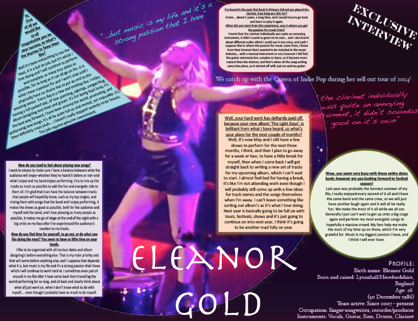
Attempted to fix the text boxes around the artists body to ensure it stands out and to add a effective creative look, which I have seen other magazines, within my genre, complete as well. Overall this didn't seem to turn out well, I think this was because of the shape of the picture (in the circle), but the reason I want to keep it in this shape is because it's almost like a spotlight for her in a finished position of her set, and also the readers wouldn't know what to read first.

Final Version
Decisions
The main reason I chose this main image was because, I felt that it was quite eye-catching and therefore beneficial for a whole double page spread. I also chose this image because she is lifting her arms in the arm, almost to symbolise her success and that she is happy with where she has got so far with her career. The reason why I chose to re-shape this image from a rectangle shape to the circle, was to emphasise that she is the main person in the spotlight, and that she is the iconic figure for this article. The reasoning behind adding the text boxes for the interview, was because it was following one of the conventions for a pop magazine and I feel that it works well as it makes the text easier to read, and seem like there is less of it, which will help to attract the readers.
The quotes are in different shapes, including the wave look and the fish eye look, because I feel that it gives a more artistic, fun feel to the magazine, and the text is not made so boring looking, adding a different look and perspective to the whole quote, possibly attracting the audience. I felt that the main image needed to be enlarged because with the first draft version (top of page), the image almost got lost and the text was too in the audience's face, which could potentially put them off, as they may feel that it is too much to read, therefore by reducing the font size along with the boxes, it seems like there is less text to read and there is more of a clear, simple format, as it has been broken up more into little sections, also the image makes the whole article aware of what it it about and the topic of conversation.
I constructed the interview myself, and thought of questions that my target audience would possibly ask an artist, along with the responses that I could imagine that artist would say, because I made up an original name for the artist and therefore couldn't interview her myself.
