Construction of our school magazine
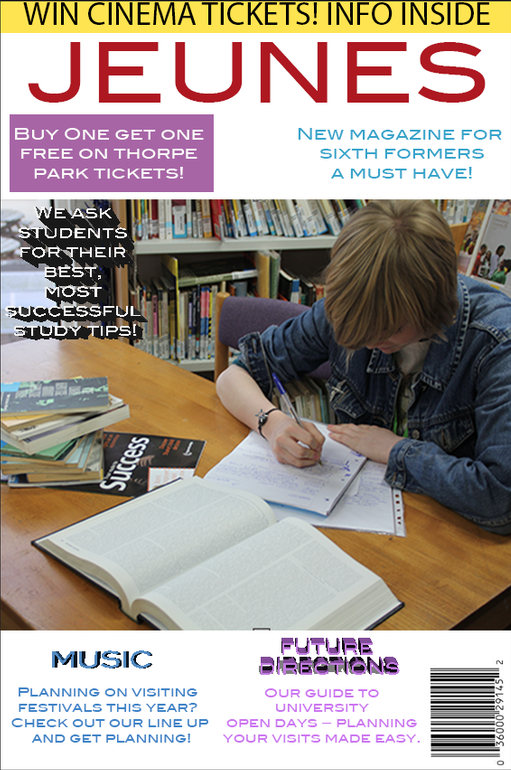
Our incomplete magazine cover (Basic plan outline).
|
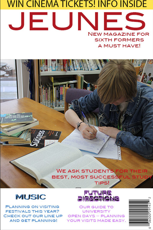
Our final front cover of our magazine 'Jeunes'.
|

Our main background design for the Contents page of our magazine.
|

Our final contents page design for our magazine.
|
After completing an analysis of our results from our questionnaires, we created a draft of our potential front cover and contents page, with a basic outline.
For the front cover we chose specific feature articles, that would be best suited, after looking at our questionnaires feedback/results e.g. study tips, along with a picture of a student in the centre of the magazine cover, in order for the audience to understand who and what the magazine is aimed at straight away.
For the contents page we created a splash of paint design as we thought it created a fun look to the magazine along with a welcome letter on the right hand side of the page, to create a friendly atmosphere.
We constructed this magazine cover and contents page both on the software Photoshop, though the use of a Mac computer. We started of by choosing the colour red as the title, as it would contrast well alongside a white background. We then took the main image of the cover and due to the shape and positioning we changed a few ideas of how the cover would be arranged, but it all worked out well with the final piece. One of the changes we made was instead of the feature articles being at the top, we moved them down to the bottom, although this wasn't our intend.
The contents page was the second page we designed and we started it off with the paint splats down the one side, again using Photoshop. We also decided to continue with the red font across the whole magazine. The welcome letter was also situated at the bottom of the page, intended, as this is where your eyes are drawn to when turning over the page, also with the white font we decided it was the best colour choice as it would help it to stand out as well.
